Kitchen + Living Room Tour with $500 Rejuvenation Giveaway
/Please note I cleaned before these photos. This is real life for about 13 minutes per week.
We've been in our new house for an entire month now. It's still hard to believe we're finally in, since this has been in the works since last May. We were lucky to find the house when it was only a foundation in the ground, because that meant we were able to pick out all of the interior finishes. A total dream.
Around the same time, I started chatting with the lovely team at Rejuvenation about possible ways we could work together. The timing seemed to work out perfectly as we were planning finishes and looking for some unique items to include in the design. While we're not renovating or DIY-ing much anymore (I take that back, Chris is currently building an outdoor bench), I still thought it would be fun to show you how the space is coming together.
This post + giveaway are sponsored by Rejuvenation.
I briefly mentioned in the last post that one of the main reasons for moving was career related. While we loved our old house and the improvements we made along the way, the space and flow were no longer working as my projects grew in size and became more frequent. I also knew I was going to have larger collaborations coming up, with multiple people working at the house, and it just wasn't set up in a way that worked well for that. I tossed around the idea of finding studio space, but it's much more involved than looking for a simple office. I need a full kitchen, storage space, enough natural light to shoot in, etc. We figured that if we could find what I needed in a home, it would make more sense than leasing a separate studio space.
Once we figured out that this was going to actually happen, we started trying to plan the overall style for the house (the layout was predetermined). I'm not sure I really have a name for our style. Sort of, soft modern meets simple industrial? I say "soft" modern, because we like to bring warmth to the space with different types of wood furniture and pops of color here and there.
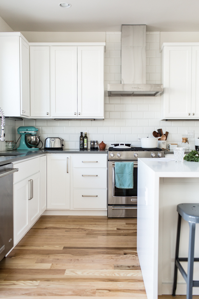
We've always loved clean lines, and if you've been here for awhile, you know I have an ongoing obsession with white cabinets. This first floor has plenty of room but isn't huge by any means (it's probably hard to gauge in photos), so we wanted to make sure we kept it feeling bright + open. This was achieved with the unstained hickory floors, white cabinets, white counter (on the island), white backsplash, and white paint.
While cabinet and draw pulls are a small detail, they make a big statement in our kitchen, because they're visible from the moment you walk into the house. I was looking for something simple and clean, but again, also with a softer look. I instantly fell in love with basically all of Rejuvenation's options, but landed on their Larkin pulls in brushed nickel. It was the 1-inch finger pull that did me in (photo above). I could not handle how cute they were but also thought the overall style was just what we were looking for.
(I'm standing in the entry of the house in this photo and the office is directly to my right.)
Next up was a ceiling fan for the living room space. This is where we started to incorporate the industrial look. The brushed nickel color makes the fan blend in with the space, rather than something like black that would have really made it stand out. It's still a sort of statement piece but doesn't overpower the room. This was important to us with how open everything is.
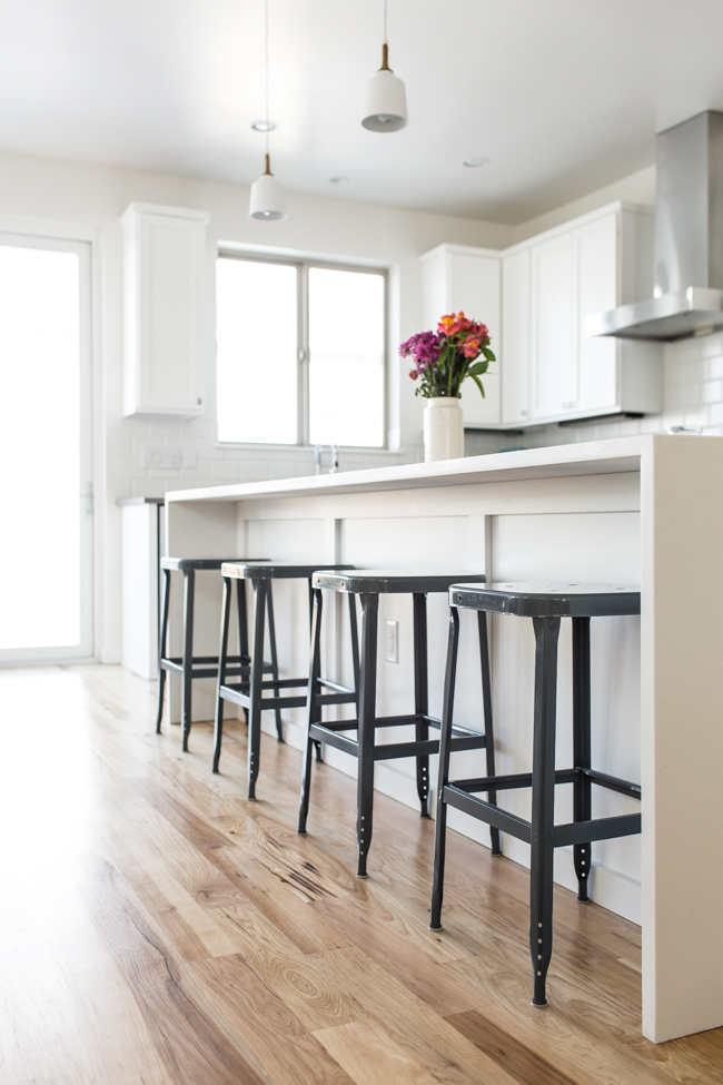
Back to the kitchen to check out these simple Aurora Industrial Stools. We wanted stools with a low profile, so they wouldn't overwhelm the space. We also wanted them to be light enough to easily move around the room but at the same time, sturdy. We thought throwing in another type of wood might be too intense, so that was quickly nixed. These had just the right amount of industrial flair and complemented the gray counter that wraps the back kitchen wall.
I'm not sure if I'll be keeping my photo cart in this main room permanently, but it works for now and is used as storage for some of my photo props. Instead of solely photographing on the cart, I am now able to photograph on our dining room table, the island counter, and the floor by the back doors. It's amazing to have different options in this house!
I will definitely admit taking photos in this space has had a huge learning curve, and I'm still getting the hang of it. There are way more windows than I've had in the past and they're south + west facing (more intense sun), so I'm really having to learn how to control the light. But I've been having a lot of fun trying to figure it all out.
To break up all of the white in the kitchen, we decided on gray counters to wrap the back wall. It added just the right amount of color and warmth to the space.
Dakota was also an integral part of the design process.
(Her bed is an inexpensive memory foam bath mat and both dogs love them!)
One of my very favorite aspects of Rejuvenation's website is the how customizable everything is. Especially in their lighting department, there are more options than you could ever imagine, and you can preview every single combination they have. It's pretty dang fantastic.
We definitely tried incorporating a bit of the industrial feel with our fixtures throughout the house. I'm pretty sure I spent hours going through options on Rejuvenation's site. Just for this Eastmoreland Semi-Flush light, you have 10 choices for the finish and 53 shade options! I decided on the brushed nickel finish and clear glass shade (14 inches) to keep things simple and clean.
(Living room is directly behind me in this photo.)
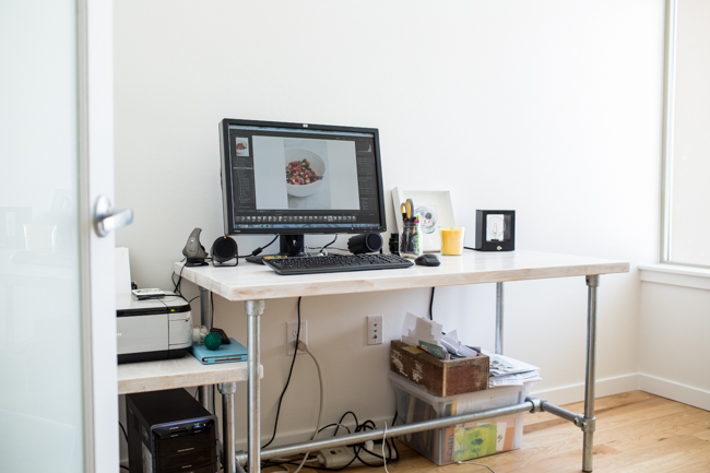
My office is a work in progress but it's already such a bright, happy space to work in. Maybe one day I'll go through all of those papers under my desk...
And that adorable little light at the edge of my desk? You can find that in 3 different wood options on their site, too!
Behind my desk is this temporary bookshelf. We've had this metal shelf for about 10 years now (used to hold a million different things), and I'm pretty sure we're keeping it for life. (The Legos were for a recent photo project.)
And now, the part you probably scrolled to immediately when you saw all of that text I just spewed out. Oops.
Giveaway!! Rejuvenation has offered 1 lucky Edible Perspective reader a $500 shopping spree to spend at their store. Check out all the ways to enter below!
Ashley
This post + giveaway are sponsored by Rejuvenation. All opinions are always my own. I only partner with brands I love and think are a fabulous fit for this blog. Thanks for your continued support!! Rejuvenation supplied the items shared in this post.
