Kitchen Reno: before + after
/It’s been far too long since I’ve posted a house update after moving back to Denver 1 1/2 years ago. We hired a contractor for most of the work in the house (majority in the basement) but still tackled a good portion on our own. The contractor was mostly for knocking down walls, building new walls, adding a bathroom, etc.
The view below is from the living room right after entering through the front door. There are 2 bedrooms (one used as my office, one as a guest room) and 1 full bathroom to the left.
(please excuse the awful iPhone “before” photos)
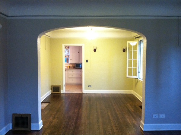
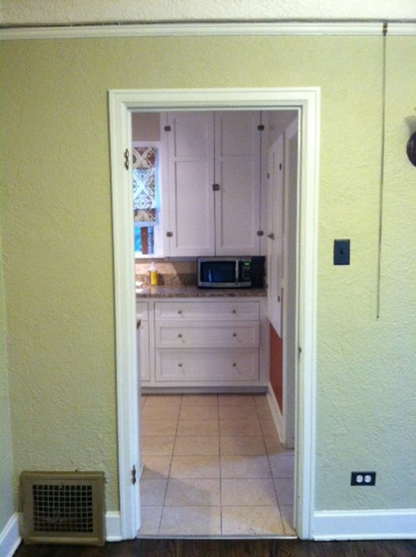
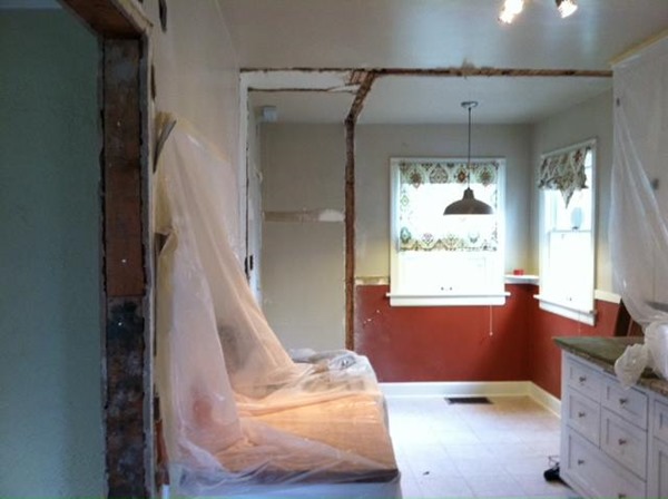
We felt the dining room and kitchen were too closed off and wanted to open up the wall a bit.
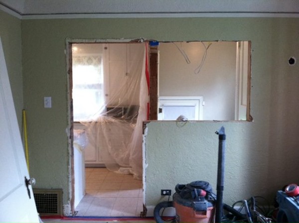
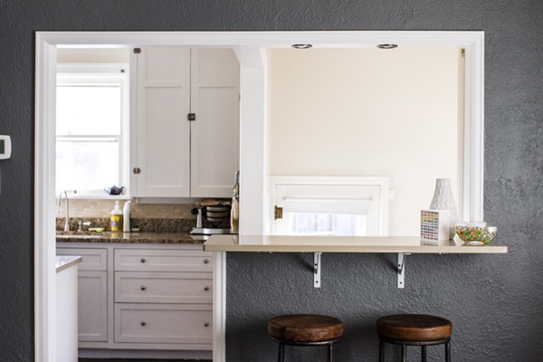
We had a large portion of the wall knocked down to create bar-height seating and to allow more light to enter the dining room from the stairwell.
There was also a door from the kitchen into the stairwell that we had removed because it made no sense.
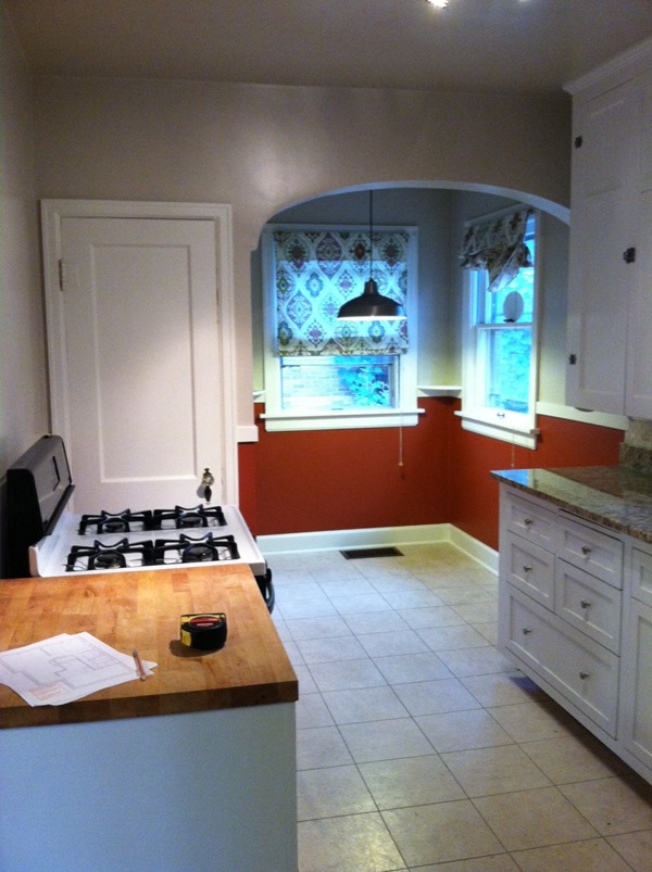
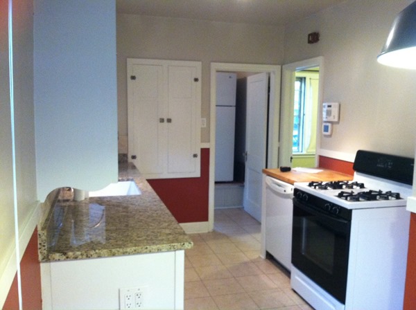
If you enter the kitchen and turn to the left this used to be the view. There was a breakfast nook and a very small pantry in an awkward spot that opened into the oven. That wall had minimal counter space with just a small piece of butcher block (in poor condition) over the dishwasher.
We knew we wanted to open up the kitchen by removing the pantry and knocking out the bedroom closet behind the pantry. It was a blank wall on the kitchen side and that bedroom has an entire wall of built in closets, so it wasn’t a big deal to get rid of this smaller closet.
This is how it looked after removing the pantry and bedroom closet. The kitchen gained a ton of space.
Our plan was to add more counter space, move the fridge into the kitchen (it was in the stairwell previously – you’ll see in the next photo), and add more lower cabinets.
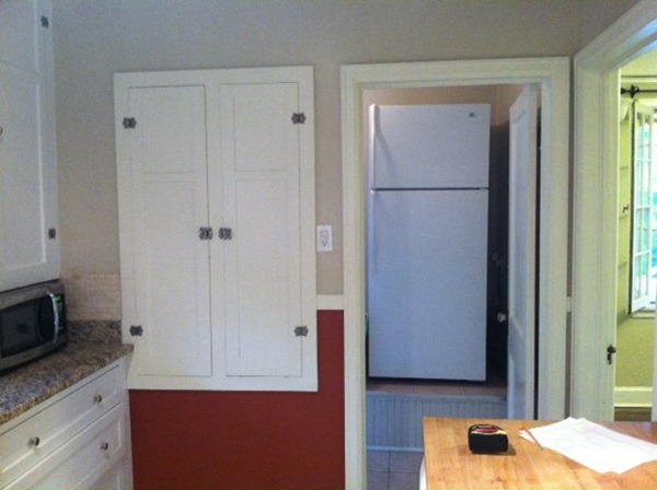
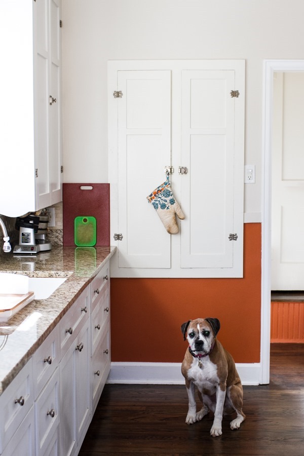
This was the view looking into the stairwell. This is also where the fridge lived, which was extremely awkward, especially because it was raised 1 foot off the ground over the basement stairwell.
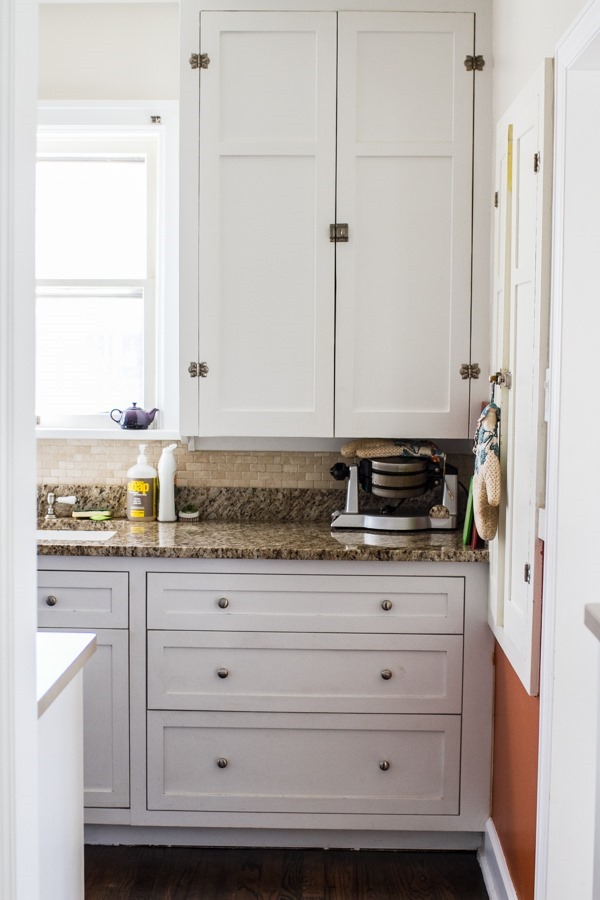
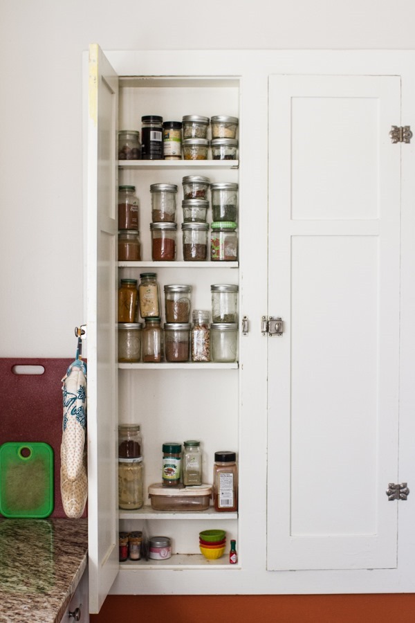
The cabinet against the wall is a very shallow cabinet that I use for spices. The right door actually used to house an ironing board! We removed it in hopes of adding more shelves for spices (this has yet to happen).
View from the breakfast nook, which is now my photography corner.
And here is the finished look from the dining room into the kitchen. I wasn’t positive I’d like the dark paint but ended up loving it in this room.
A closer look through the kitchen doorway.
The cabinets on this side of the kitchen are original with the original hardware on the upper cabinets from 1932!. I am a white cabinet lover.
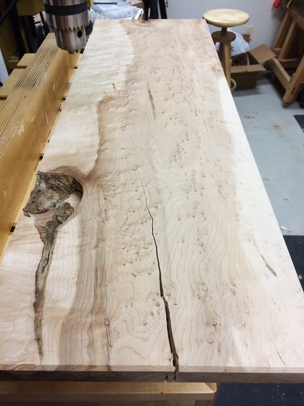
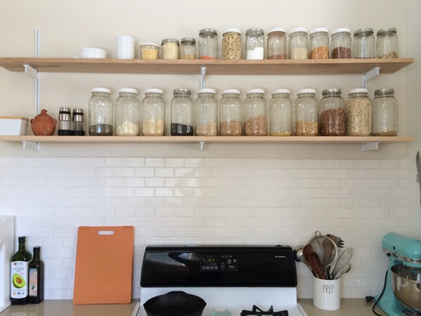
It took us over a year to finally add kitchen shelving, which I am now slightly obsessed with. We bought rough-cut birdseye maple wood at a specialty wood store to use for the shelves. This wood has so much character that we didn’t even end up staining it. Here’s a close-up view after cleaning it up.
The wood was really rough when we bought it and took an evening of work to get it into shape to use in the kitchen. Luckily, Chris’s coworker has a wood shop in his garage and offered to help us. There was no way we would have been able to do this on our own. The tools we had to use were pretty intense!
The only finish I used on them was a water-based poly with a satin finish. I wanted the shelves to look as natural as possible.
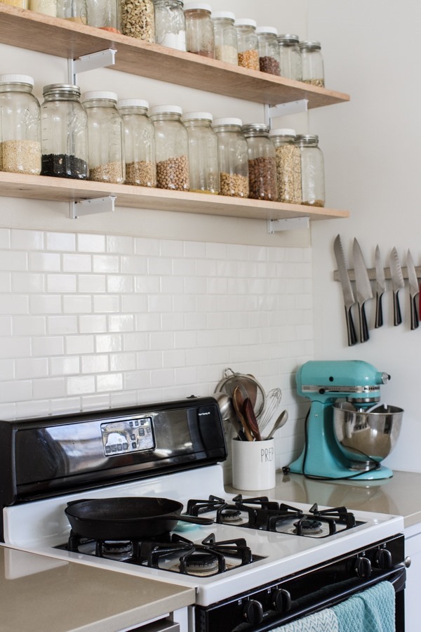
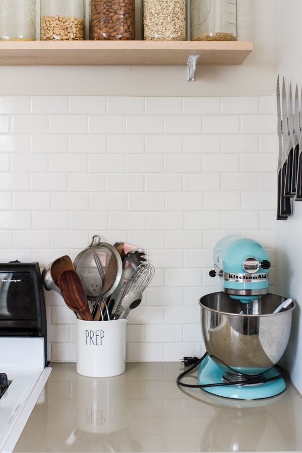
Having the shelves has freed up a lot of cabinet space that was previously taken up by all of these jars.
Filling jars with bulk items is my kind of (functional) decorating.
I’ve shown this spot in a few other posts before, but this was the previous breakfast nook that is now my photography space.
This was also the day after making a HUGE prop run for an exciting project I’m working on. It gets a little annoying having all of my backgrounds, surfaces, props, tripod, light bounces, etc. in the kitchen but it’s really the only spot I can take photos so we make it work.
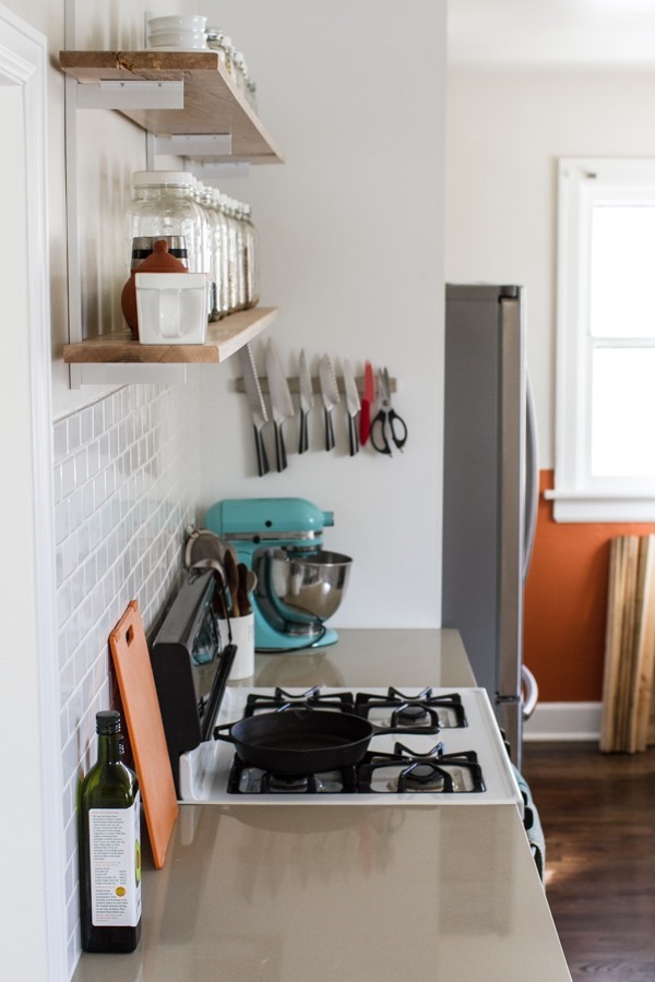
When we added new cabinets on this side of the kitchen, we obviously had to add counters. Instead of matching the granite on the other side we went with a solid color quartz that complimented the granite colors (and was far less expensive than matching the current granite).
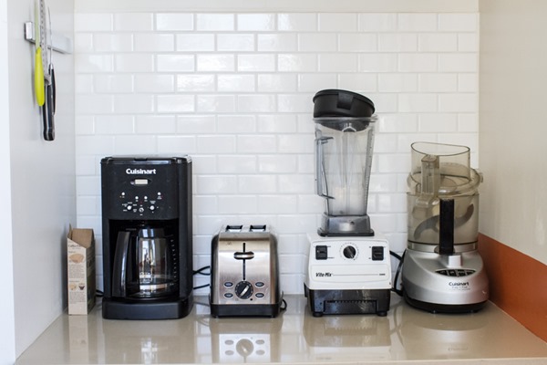
On the other side of the fridge in my photography area is a sort of hidden counter/cabinet space that houses most of our big appliances. It’s so nice to have them out of sight and it also provides me with a convenient space for setting a million different things while I photograph.
I installed all of the backsplash in this area and below our new shelving.
I’m so over tile installation after this house and the last but am happy with how it turned out.
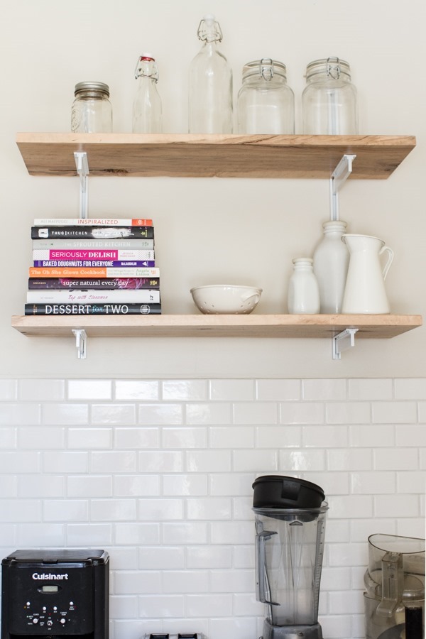
Above the appliances are 2 more shelves to house empty jar overflow and my most used cookbooks. It’s very convenient to have these at an arms reach.
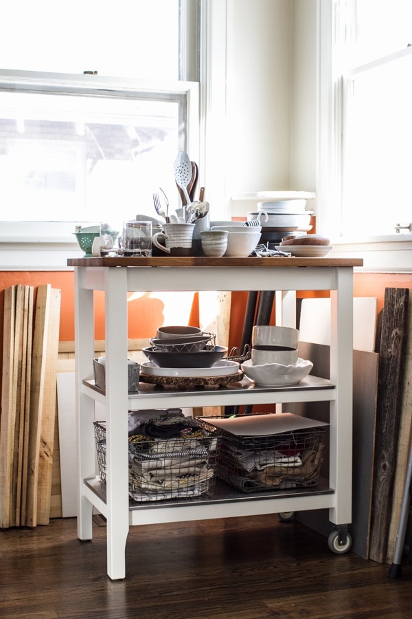
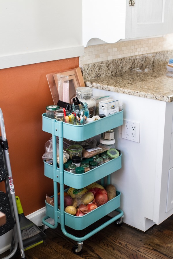
On the other side of my photography station is this cart that overflows with spices, onions, potatoes, and random small photo props.
An iPhone shot of the original kitchen (with granite counters). At some point we’ll have this backsplash tile removed and white tile installed to match the other side. I tried removing the old tile myself but started taking the drywall with it, so we decided to let professionals handle this job.
Opposite side (iPhone).
The kitchen does get a good amount of light in the morning, but the 2 corner windows are a little challenging to work with for food photography. They’re also high (at counter height) so I am unable to photograph anything below the bottom of the windows. The light gets too muted and dark if I use a lower table. Overhead shots require a step stool for sure.
The other door is still empty but will hopefully have some shelves soon!
The kitchen is about 90% done at this point. We are beyond happy with it at this point and hope that we can get it all finished up sometime soon. Which will probably end up being before the next time we move.
Hope you enjoyed this peek into our kitchen and the renovation process it underwent!
Ashley
