edible homework – shadows
/I’m so excited about this post! I’m going to show all of the edible homework submissions I received and talk a little bit about each one. First, before I do that, I’ve had some emails asking about my photography set up.
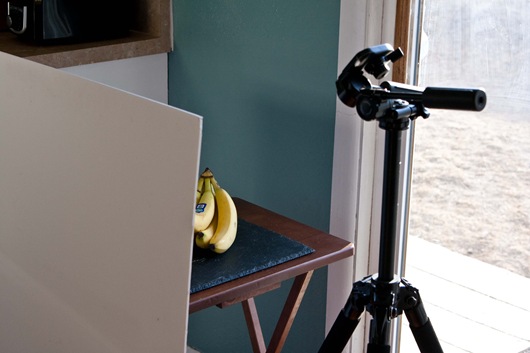
In all honesty, it’s a little shoddy. I give myself about a 3’ x 2’ workspace by the sliding glass door, just like I showed you in my sweet paint drawings last week.
My light bounce is a large piece of foam board, that I prop against a super small $8 table. You can find the foam board at Michaels. It’s about 1/4” thick and is a fairly stiff material that stands well. You could also build a little arm off the back or prop it with a box.
So, in this position, the light is coming from the right. I take 90% of my photos this way. It’s pretty funny to see this photo. It looks SO small, and it really is. It’s the best light in the house though, so I make the space work.
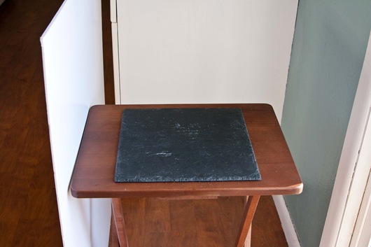
This is the black surface I shoot most of my photos on. Sometimes I use towels, but I really like how the black background makes food pop! I don’t use any type of background behind the table, except the white cupboard. Sometimes, I have a hard time keeping that blue wall out of shots.
So this is it! Fancy, huh? I’m already nervous about finding a good spot in the new house. The best light is in one of the spare bedrooms. We’ll see how that works!
I keep a pretty tight angle on my food when I shoot it. Hopefully, I’ll be able to get a bit more legit setup at some point, but this will have to do for now.
Oh, and the black tile thing? That’s a slate cheese plate from crate + barrel. :)
And now to all of your submissions!
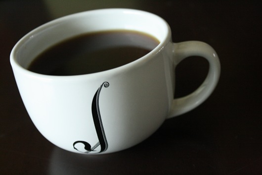
This first submission, comes form the lovely Janetha, from Meals & Moves. I loved looking at Janetha’s simple coffee photos. She played with the camera angle and 3 different kinds of light.
She posted about “playing with light” in this post. Be sure to check it out!
This first shot is taken with backlight.
This second shot is as well. I love that she took 2 photos, at 2 different angles, using the same light. It’s fun to compare what look a different angle can give you in the same type of lighting condition.
I love this photo! The angle is pleasing to the eye and it looks like the bright morning sun coming in from the corner.
Side light. Not too much different from the back-lit photo, but not quite as bright.
Now this, I love! The angle again, is great. I love that the side light is hitting the front left area of the mug, but also hitting the back right side, inside of the mug. Beautiful!
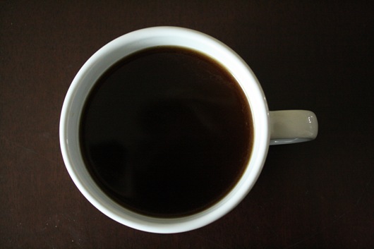
Now for front-lit photos. Still, fairly similar, for this overhead shot.
My favorite of the bunch! Another front-lit photo. I love that the front-light brightens up the right side of the mug, in comparison to the more shadowed, side-lit version.
Thanks Janetha!!
This next submission comes from Kath, from Kath Eats Real Food! I love that Kath’s photos are always full of COLOR! Everything always looks so fresh + delicious. I also love that she takes morning photos outside. They just feel so crisp and morning-ish..if that makes sense. :)
Another coffee submission!
Kath, took what looks like a front-lit photo on the left and a side-lit photo on the right. Do you have a favorite?
Mine is the side-light. I love the shadowy effect on the left side of the mug. I also prefer this angle, where you get to see a bit more of the coffee. The curvy mug she used also looks like it’s pulling to the light, reaching for that morning sunshine! Thanks Kath! :)
Mmmm, apples. I definitely eat one almost every day! Thanks to Michelle from A Voracious Appetite, for submitting these next two photos. You can check out her post about it here!
Michelle uses a Canon PowerShot SD1300 IS as her photo taking device. I loved her take on the “homework.” She photographed the apple at the exact same spot, at 2 different times of day.
This first photo was taken around 11am.
The 2nd photo was taken at 2pm. Only 3 hours later, and such a difference. Can you see it? The top photo has much more shine on the front of the apple. It’s much brighter in general. The top of the apple on the first shot is shinier as well. The light looks stronger coming in from the right, with the 11am light.
Pretty amazing how a few hours can change things so much! I’m having so much fun with this!!!!
Thank you Michelle!
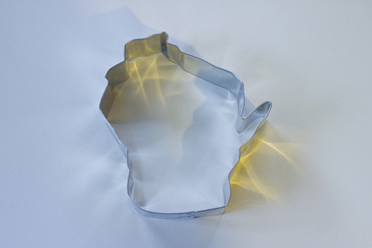
I loved that this next submission was of an object and not food. I’ve never seen a state shape, made into a cookie cutter! This comes from Kelly, over at Brownies and Zuchinni.
Kelly’s photos are really interesting because of the light bounce from the shiny object.
She said she wasn’t expecting the light to bounce so much, because she typically doesn’t think about what the light will do. I love that it’s casting shadows and bouncing light all at the same time! Now where are the cookies that go with this cookie cutter? ;)
Thanks Kelly!
Light is such a fun part of photography, but also confusing. The best thing you can do is play with the light and see what you can do. Even if you create a bad photo, you learned something!
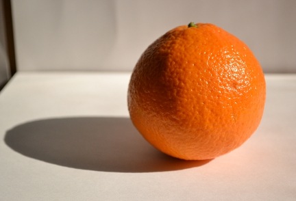
Similar to the apple experiment, the orange photos are of the same object, in the same spot. One is taken with a light bounce and one is not.
These come from Heidi at Food Doodles. Heidi plays with her photography a lot on her blog and seems to really have fun with it.
The first photo is taken with a light bounce. I love the strong shadow! The light is coming in from the right and the bounce is helping to light the left side of the orange.
Here is the photo with no light bounce. Quite the difference! The light on the right side of the orange is much more harsh and obviously the shadow is much stronger because there is no white surface bouncing it back onto the orange. Heidi said that learning to bounce light allowed her to find a new photo spot in her house, that works much better.
Yay! Thanks, Heidi!
This fluffy, delicious looking basil plant submission, came from Michelle from Gold-Hearted Girl. Michelle’s blog is really fun and I love her photographic eye!
Michelle took this first photo with no light bounce.
In the 2nd photo she bounced the light using a paper plate! I love it. I used paper towels for awhile. It definitely works and you can clean up any messes after. ;)
The light in this photo is more balanced and brightens up the plant all around. The plant looks shinier and more alive! Thanks Michelle!
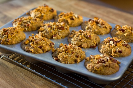
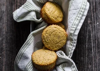
I want to eat this next submission from Molly at Doughing Rogue. [love the blog name!!] The muffins are sweet potato graham muffins. Yummmm. Molly is new to the blog world as of March. Welcome!
This first photo does not use a light bounce. The photo looks somewhat back-lit but also like light is coming from the left side. I love the light hitting the tops of the muffins in the back. They look sun kissed!
For Molly’s with light-bounce photos, she wrapped foil around foam board, for a super intense bounce! Check out the difference! She said she didn’t like this at all. She felt it looked fake. Using just the white surface of the foam board, may have softened up the bounced light a bit. But, as I’m learning, sometimes no light bounce is better!
2 more, 2 more!
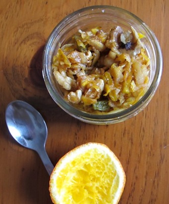
Lauren, from The Spiced Plate, sent over this next submission. Lauren informed me that she is new to taking food photos and uses a Canon Powershot. She’s been playing around with light at different times of day and in different rooms where she lives. Looking good so far, Lauren!
The photo is of a charoset. What is that? I know I know! It’s an apple-raisin-walnut mixture, typically eaten during Passover.
The first photo is on a cloudy day, with light coming in from the right.
In this second photo, Lauren turned so the light was coming in from behind her. As Lauren said, the light is a bit harsh, but I do like that the charoset is brightened up in this second photo. My favorite angle + photo setup, between the two, would be in shot number one. Thanks Lauren!
Last but not least, Averie from Loves Veggies and Yoga, wrote a fabulous post on her light study. She took a LOT of photos that are really worth checking out. You can tell she definitely had fun playing with light, during all times of day, in different spots of her house.

As she moved around her house, even though it was the same time of day, she noticed the light was much more yellow in certain areas.

She also played with different angles and vertical shots. I tend to not take many vertical food photos, but want to start playing with them more. I love how the food is coming right at you in this photo.

This was my favorite from Averie’s bunch. The angle is lovely, the colors are great, and the light is nice and bright. Averie said she learned 3 main things from this exercise.
“Lighting matters.
Angles matter.
Cropping matters.”
I couldn’t agree more! Thanks Averie!

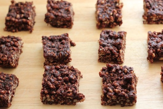
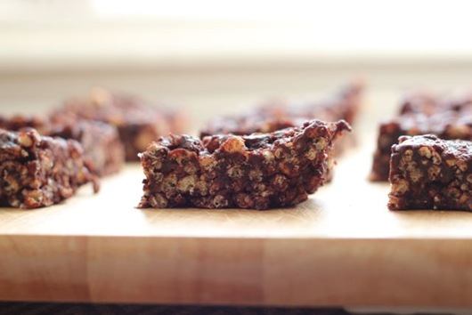
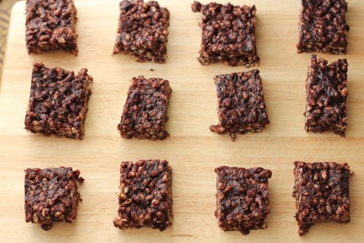
*Edited to add* I completely missed one of the homework emails. I’m so so sorry Marci!! Marci from Marci Gilbert’s Blog sent a few photos, of a deeelicious looking recipe. I love that she also sent a photo of the window with the light coming into the room. The angles she chose are very pleasing to the eye. All of the photos were taken with her new 50mm lens. Love that lens!
Here is her lovely photo spot.
The first shot is from an above angle with the light coming in from behind + above. You can tell the light is coming in from behind because the front of the bars are in shadow. If you want more light to be thrown back on the bars, you could set up a light bounce right in front of your body but before the bars.
The light coming is so soft and pretty!
The second shot was taken from the exact same spot, but at eye-level. You can really get a sense of the texture of the bars.
In this last shot, Marci turned the tray and moved her position. The light is now hitting the bars from an above-left angle. I think my favorite angle is the first photo, but I like the light in the last photo the most. Thanks so much Marci and sorry I forgot to post your photos!!!
Phewwwww! That was a long one, but so much fun for me to type up. It was really different to use YOUR photos and write up a post to go along with them. I hope you enjoyed this as much as I did and learned something along the way too! I definitely want to assign more edible homework soon. Be on the lookout!
Keep playing!!
Ashley
